Thursday, 20 December 2012
Thursday, 13 December 2012
Sunday, 2 December 2012
Evaluation Question 2 - How effective is the combination of my main products and ancillary texts
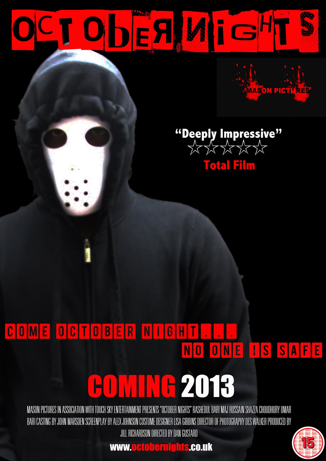
The way I connected all three to maintain a consistent brand image is I used images of the antagonist wearing the same costume and the same mask in all three products: I used the image of the antagonist on the magazine and the film poster, this connected the two products so audiences would know that the two products are from the same film. The antagonist is also in the trailer itself wearing the same costume and the same mask, to link all the three products to each other. In both the magazine and film poster, the colour is dark and sets the tone of the film, this is done by the costume being black. In the trailer, it is very dark lit to match the magazine and poster in terms of colour. The way the three products are linked to each other in terms of the font is the main title, "October Nights". The font called "Phorssa" is used in each product, this links each product to each other and shows the audience that these three products are from the same film.
The genre of the film is thriller and this is evident in all three products. It is evident in the poster & magazine as the antagonist is pictured on both, this gives an allusion to the audience of what the genre of the film might be, the way this is done is through the masked person pictured, it creates mystery as to who this person is and the thriller genre is all about mystery and suspense. The way the genre is identified in the trailer is the plot of the trailer. You see the masked antagonist which creates the mystery and the audience will get a hint that this is a thriller, but then you also get a man who gets kidnapped which is also a common plot device of thriller films.


The target audience of this movie is people who love an entertaining movie but also people who love mysterious, suspenseful movies that will be intrigued by the masked antagonist and the story of the film. I have reached the widest possible audience by using all these media platforms: trailer, poster and magazine. People who read film magazines will read about the film and this will create publicity for the film. People will see the poster plastered on bus stops and other public places and also on the internet which will create a buzz for the movie. The trailer shows people what they might expect if they watch this movie therefore reaching the widest possible audience.
You would see the trailer in a cinema before the screening of another thriller film, it is imporand tant to screen it before another thriller film because it would then be shown to our target audience and this might start the buzz of the film by the actual target audience. It will also be uploaded to Youtube, this is pivotal as billions people visit Youtube daily to watch videos and this will only help create a buzz for my film. From Youtube, people might view the trailer and like it so much that they want to show it to their friends. They will do this by clicking on the "share" feature and from there you can either "share" this trailer to Facebook, Twitter etc. This will let the person's friends on the social network to view the trailer and could potentially widen the target audience, the possibility of hundreds, maybe thousands people watching my trailer will be extremely beneficial. The poster will be used online but also in actual places plastered on walls outside cinemas, plastered on massive billboards, this would catch the attention of the public and might interest them into taking a look at the trailer. I have created a mainstream magazine as the genre is very mainstream, it targets the mass audience and is not an indie movie that has a minor audience. The sell lines also make the magazine mainstream as there are sell lines concerning major stars such as Tom Cruise, Brad Pitt. This would attract to the mainstream as they both are major hollywood stars. There can also be a website that contains exclusive features of the movie such as behind-the-scenes pictures & videos, interviews with the cast members, photos etc. This will greatly increase the target market as many people are online using the internet everyday.
Saturday, 1 December 2012
Friday, 23 November 2012

Tuesday, 9 October 2012
Logo creation of Mason Pictures


As you can see, I have compared this logo to a professional one like, Lionsgate which often makes very dark, gritty films therefore I have taken inspiration in terms of the name, making it very mysterious and ambiguous.
This is one of my drafts for the logo of my production company that will be featured on my trailer. As you can see i have started with simply putting a picture of a freemason sign and edited it to take the 'g' out and from there I used a brush tool to make 'M' and 'P' and finished it off by simply writing 'Mason Pictures' in a red font.
Thursday, 4 October 2012
Logo Creation of Touch Sky Entertainment


This is how I developed my logo from an empty page to a logo suitable to be in a film trailer. First off, using a cloud brush tool that enabled me to get the dark sky look, then I used another brush tool of a handprint to get the "Touch" in my Touch Sky entertainment logo, then finally I used a medieval font of "Old London" to further enhance that dark and dreary look I am trying to get to match the genre of my trailer.
Tuesday, 2 October 2012
Rough cut 2 of poster and feedback

- Needs more text to fill up the empty spaces
- needs a date of when its coming coming out
- The tagline needs to be a smaller size to not be bigger than the title
- It needs a better style font, looks too much like a horror film
- Tagline needs to be a different font than the title of the movie
Rough Cut 2 of magazine and feedback
- Needs more sell lines to fully convince the readers to buy
- Needs a better photo its bad quality and too dark, you cant see anything
- Needs different font styles, they all look the same
- better layout needed, its too messy and all over the place

Monday, 1 October 2012
Rough cut 2 trailer and screenshots with feedback


- Needs a better soundtrack, empty gaps need to be filled
- Needs More faster pace editing to work better as a thriller
- Needs More better lit shots, its not very clear what happening
Sunday, 30 September 2012
Rough cut 1 of print and audience feedback

- Poster needs better font for tagline, its a very basic and un-interesting font
- Needs better placement for title of the movie
- Need a better antagonists face can be seen, therefore giving away the movie

- Needs a better picture, its of a bad quality and readers wont be impressed
- Not enough sell lines to fully seduce the audiences into buying this magazine
- Needs a better masthead, its too long and not snappy enough for a movie magazine
First Draft of Trailer and Audience Feedback
- We need to edit sequences faster to be more effective and to fully grab the audience and make them interested
- We need a better soundtrack to compliment the trailer
- There is a lot of ambient sounds cluttering the trailer makes it look un-proffesional and tacky therefore needs better sound editing
- There needs to be more locations for better overall trailer, more locations needed for a better story as well
Saturday, 29 September 2012
Development of poster


I have used various fonts, brushes and pictures to make the poster. The red font colour is to symbolise not just violence but also mystery. The red handprint is to conceal the antagonists identity and preserve some of the mystery and for also audiences to guess about the movie.
Soundtrack


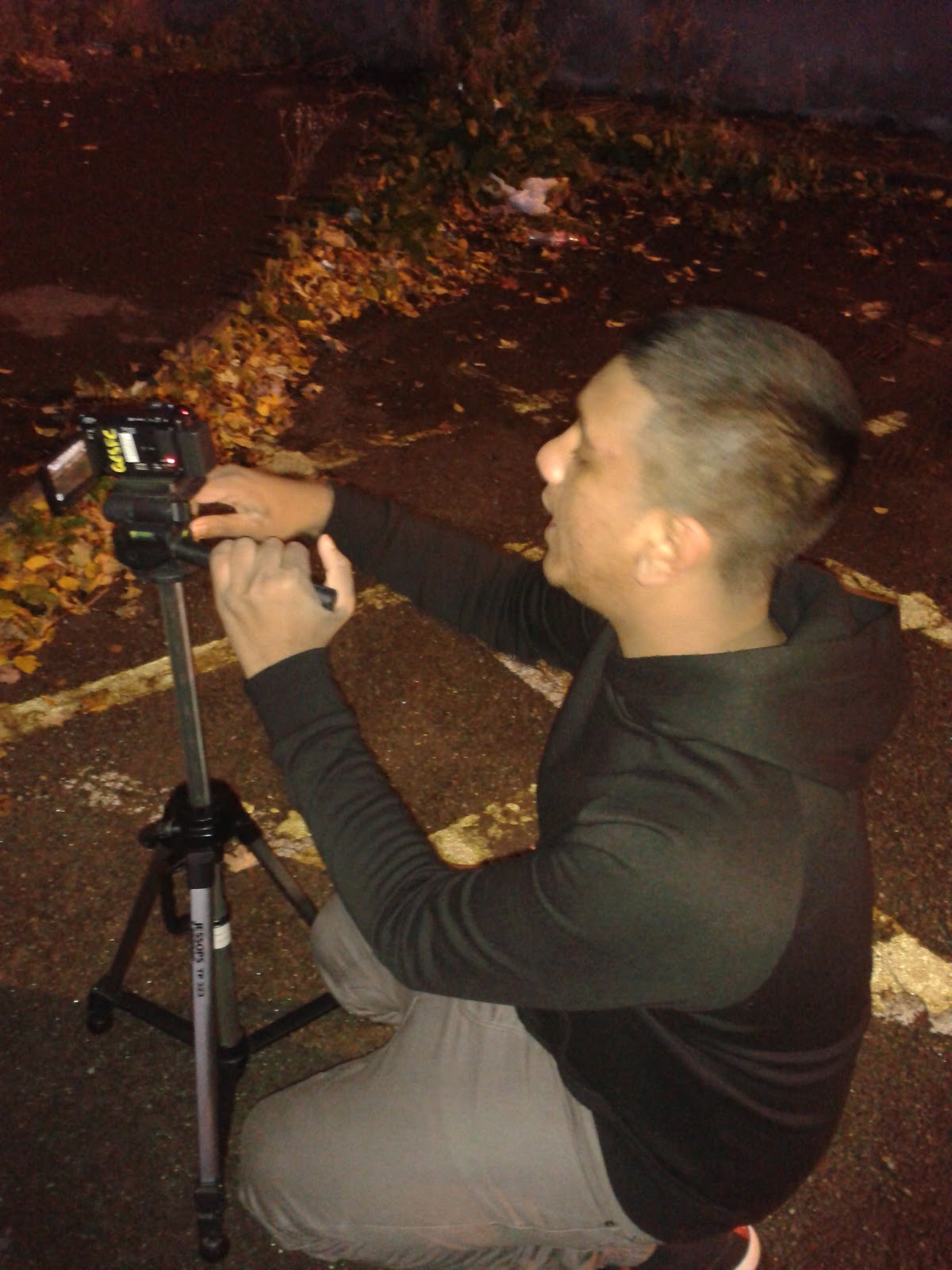
This is the soundtrack for my trailer. As you can see i have used both garage band and final cut for my soundtrack. The way I did this was use websites to download legal sounds to use in my trailer and importing them into final cut. We then had to trim, place and time the sounds in accordance with the scene that was playing.
Development of magazine cover


This is the stages for the magazine. The picture is purposely blacked out to conceal the identity and mystery for readers to keep on guessing about the plot of the movie. The red is there again to give a hint of violence that will come forth into the movie.
Friday, 28 September 2012


Subscribe to:
Posts (Atom)